Secondary Colors: Color Contrast
Requirements
We are required to pass WCAG AA at a minimum.
Color contrast is very important regarding accessibility. To be most accessible, we want to pass WCAG AAA.
According to WebAIM: “WCAG 2.0 level AA requires a contrast ratio of at least 4.5:1 for normal text and 3:1 for large text. WCAG 2.1 requires a contrast ratio of at least 3:1 for graphics and user interface components (such as form input borders). WCAG Level AAA requires a contrast ratio of at least 7:1 for normal text and 4.5:1 for large text.”
Sometimes if a color does not pass at normal text size, it will pass in a larger size text. According to WebAIM: “Large text is defined as 14 point (typically 18.66px) and bold or larger, or 18 point (typically 24px) or larger.”
Color Checker: https://webaim.org/resources/contrastchecker
Below you will find color combinations of our brand colors that are passing (and at which level) and those that are not passing. Please keep these in mind when designing for digital assets.
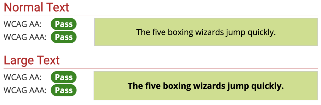
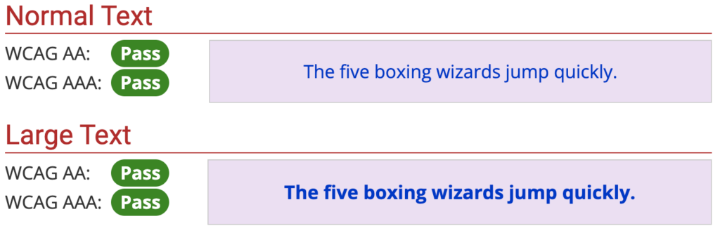
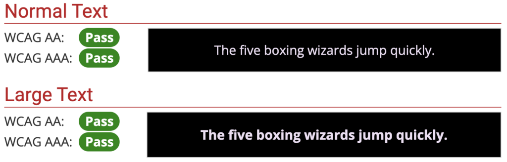
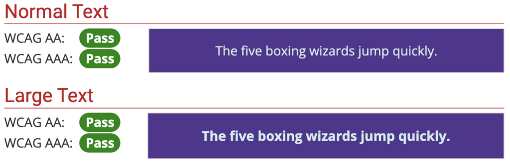
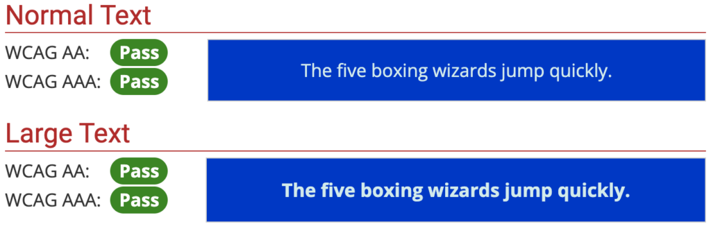
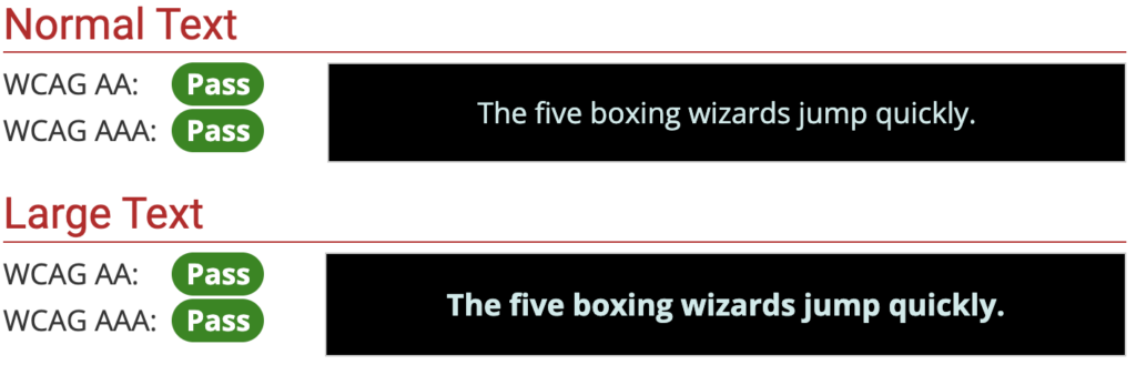
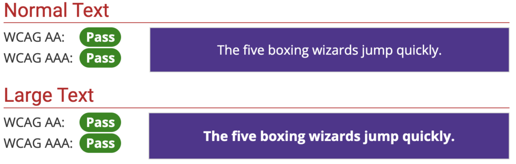
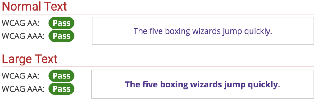
Pass WCAG AAA
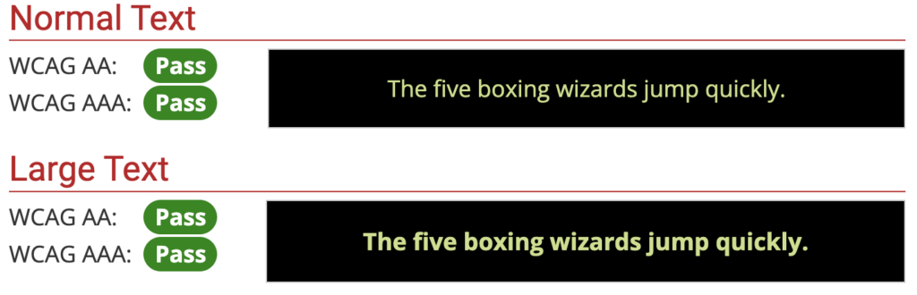
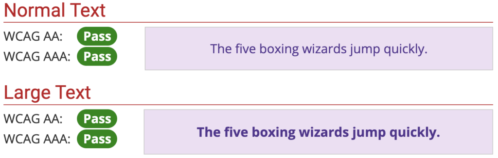
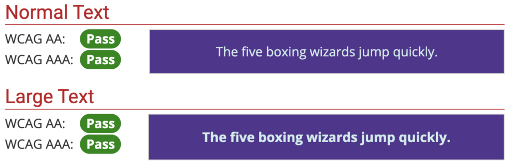
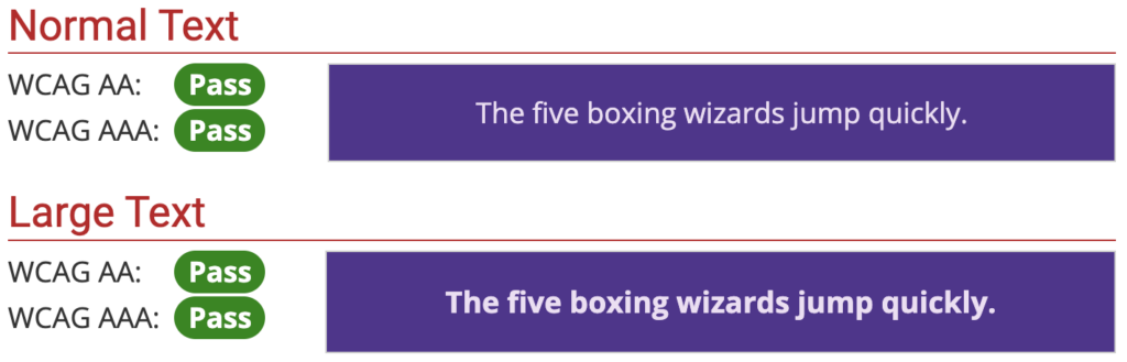
These pass WCAG AAA for regular and large text sizes.


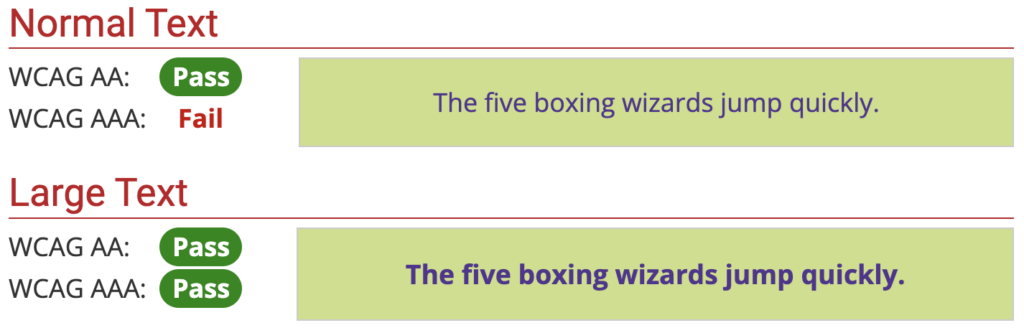
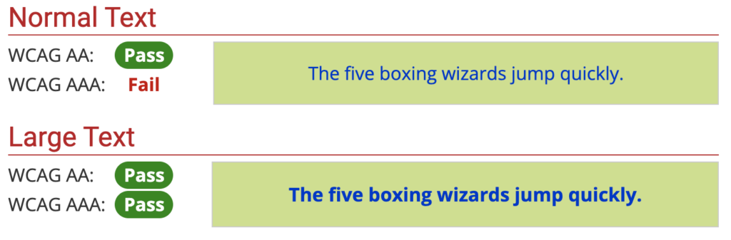
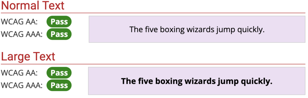
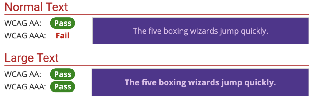
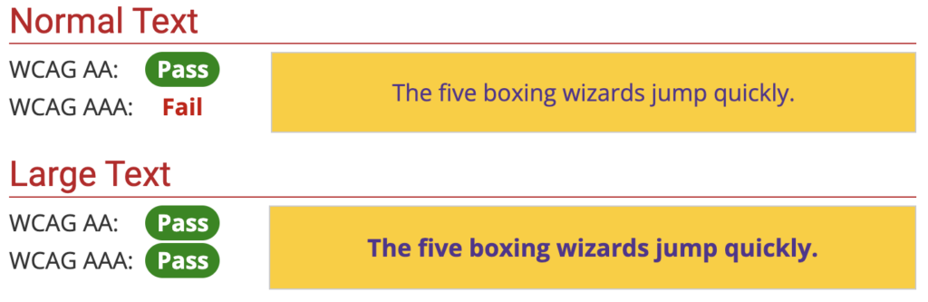
Pass WCAG AA
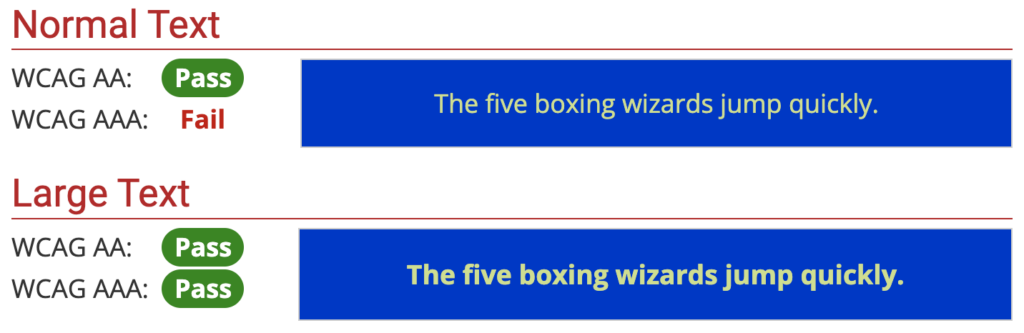
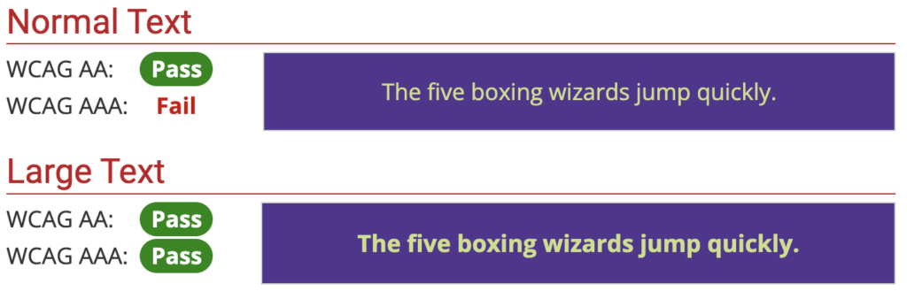
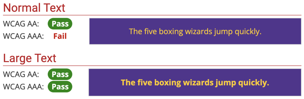
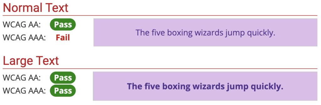
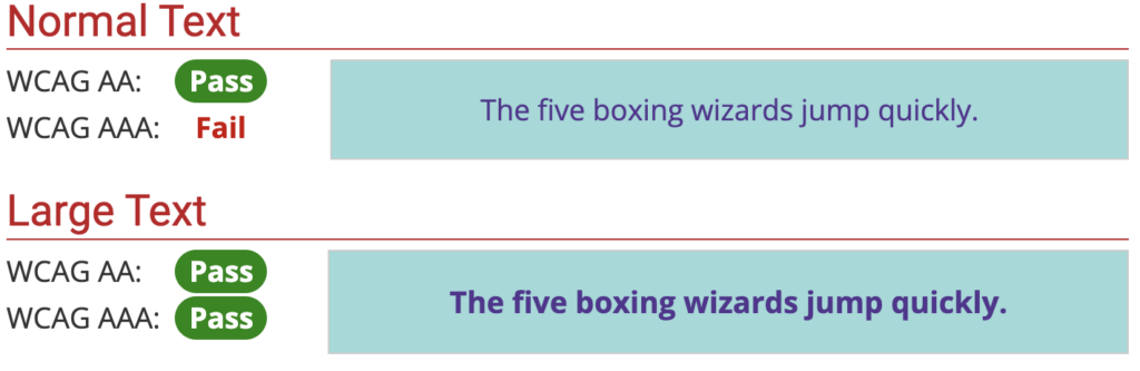
When using regular text sizes (not large text size), these colors pass at WCAG AA. They pass at WCAG AAA if you use large text size.


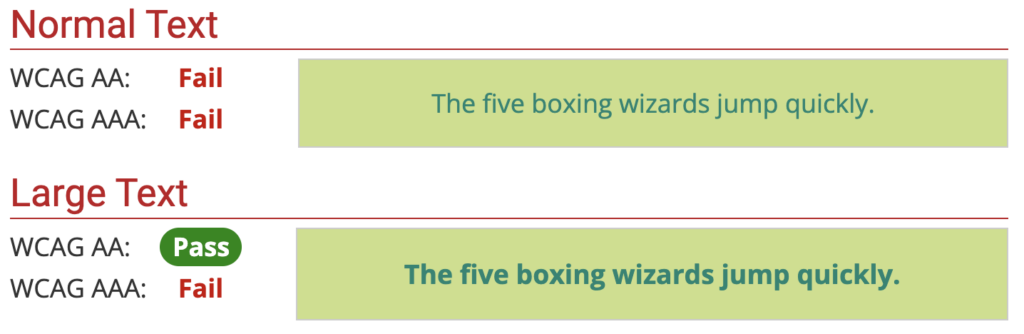
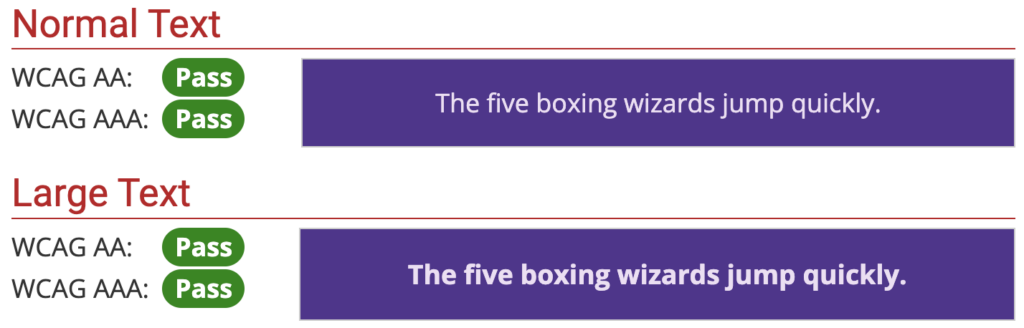
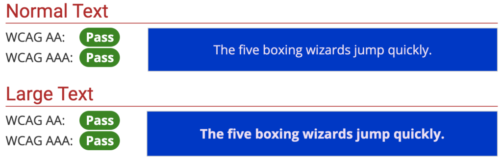
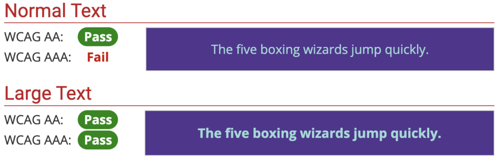
Large Text Size
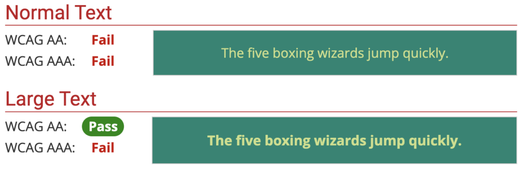
These color combinations MUST have a large text size when used in order to pass the color contrast test. This will pass WCAG AA.


Not Passing
Here are some examples of combinations that do NOT pass any of the color tests:


View By Color
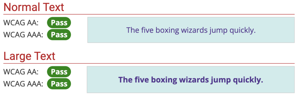
Semiviolet
Semiviolet Background
Semiviolet Text
Back to Top | Back to By Color
Pale Blue
Pale Blue Background
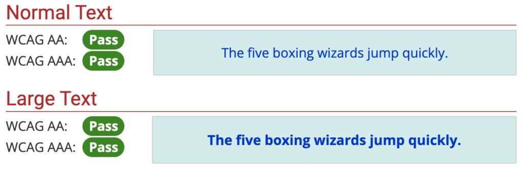
Pale Blue Text
Back to Top | Back to By Color
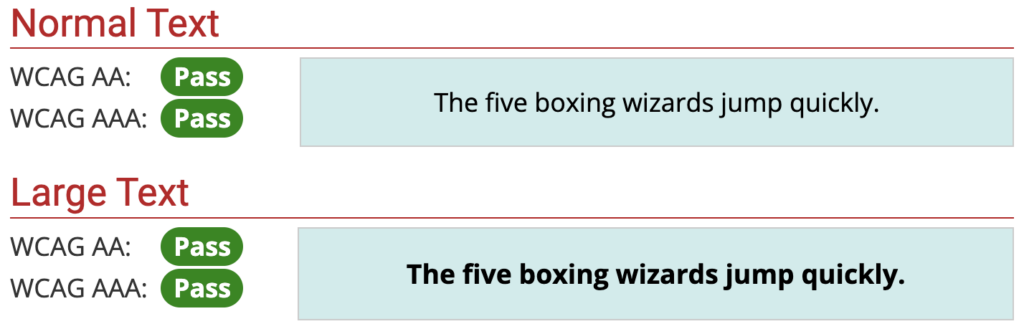
Cosmic Purple
Cosmic Purple Background


Martian
Martian Background