Readability & Accessibility Overview for Digital Materials
It is best practice to consider color contrast when designing digital assets. Text with high color contrast allows for better readability. We are required to pass the WCAG AA color contrast test for all of our digital assets on the web. We should be following these guidelines both for digital assets that are public-facing and for digital assets that are for internal staff use.
In addition, it is best practice to consider color contrast in print materials as well. If something is hard to read on the web, it could also be hard to read in print. Also keep in mind that while some materials are designed primarily for print, often they are also uploaded to the website to be made available digitally.
Besides color contrast, other aspects of type, layout, and formatting in digital materials affect accessibility too. Below you will find an overview of some best practices of what is recommended and some examples of what to avoid. This page lists common issues that affect readability. If you need more information please review the additional resources listed below or contact lawrencecomms@berkeley.edu for assistance or questions.
Examples of Digital and Print Assets
Take a moment to review some examples of digital assets. If they are on screens, they still need to follow color contrast and readability best practices even if they are not on the public-facing website.
Digital Asset Examples:
- Online applications
- Digital ads
- Digital banners
- Digital charts, tables, or graphs
- Digital flyers
- eBooks
- Email newsletters
- Online forms including Google forms
- Graphics
- Images with text overlay
- Logos in email signatures
- Maps or brochures that will be posted online
- PDFs
- Projected materials
- Slide decks
- Social media
- Spreadsheets
- TV or Navori screens inside the building
- Videos with text overlay
- Videos with captions
- Web pages
- Word or Google Docs
Here are some print examples where we use our brand. We want to make sure print materials are readable and accessible for everyone as well.
Print Asset Examples:
- Books
- Brochures
- Building signs
- Maps
- Office door signs
- PDFs
- Postcards or other mailings
- Printed applications
- Printed flyers
- Printed forms
- Printed learning activities or instructions
- Printed newsletters
- Printed publications
- Van wraps
- Wall banners or hanging banners
- Wall paintings
Color Combinations
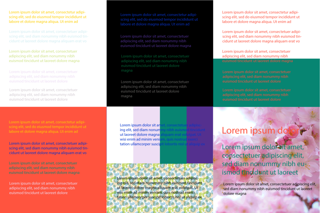
Color Combinations to Avoid
This is an overview of some examples of combinations to avoid when pairing colors.
For more information on color and accessibility and for examples of what someone might see who is color blind, visit UC Berkeley’s Digital Accessibility – Color page.
Try to avoid these:
- Light colors on a light background (Ex: yellow, light blue, light green, pink, or gray on white backgrounds can be hard to read)
- Text over a pattern, gradient or multiple colors
- Text over an image unless you are sure it is readable and meets color contrast standards
- Dark text on a dark background (Ex: blue or purple on a black background)
- Yellow, blue, green on red backgrounds
- Red text and red headings can be hard to read in general, on white backgrounds too. Try to use this sparingly or choose another color.
- Any brand color combination that fails the color contrast test (for text)
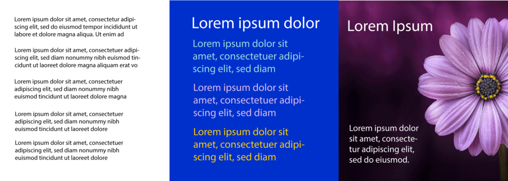
Color Combinations that Work
- It is best to use black for paragraph text on a white background as the default as this is the most readable, especially if there is a lot of text to read.
- The higher the color contrast the better when choosing color combinations.
- The WCAC AAA brand color combinations we have listed have the highest color contrast. To include more brand colors, you can also use the WCAG AA color combinations as well.
- We have some brand color combinations that pass WCAG AA in large text size. If you use these, please make sure your text size passes the requirements, otherwise these color combinations will fail. A good use for these would be headings or flyers where the font size is larger than regular paragraph text.
Text Styling
Text Styling
- Outline text can be harder to read or even be unreadable for some people. Choose use cases thoughtfully for when to outline text.
- Avoid all caps. This is harder to read.
- Don’t underline text unless it’s a hyperlink.
- Avoid large amounts of italics.
Line Height
- Line height can also affect accessibility. Lines that have very little spacing between them can make it harder to read especially in paragraph text. For more information, view w3.org’s information on line height for web and other documents.
Font Size
- Font size also affects accessibility. Font sizes that are too small make a document or flyer not accessible.
Font
- On the web, sans serif is easier to read than serif fonts and sans serif should be used for paragraph text.
Formatting
- Use left-justified paragraphs, not centered
- Apply headings to your documents
- Use the built-in list formatting, don’t use dashes, because then it will be marked up as a list.
- Text stretching entirely across the screen or page is harder to read and should have a max-width so it doesn’t stretch as far.
QR Codes
- Include a URL or short URL along with QR codes for visitors who don’t have a working QR reader on their phone.
- Make sure the text that describes what the QR code is for is close to the QR code itself so it’s clear where the link goes to.
Alt & Link Text
Alt Text
- If you are uploading content to the web, be sure that you are adding clear alt text for your images.
- Any images with text overlays that are uploaded are not accessible because a screen reader cannot read the text in the image. For this reason we need to make sure that we describe the image using alt text. In general, if there is text in the image, that text should also be in the alt text.
- Consider that when uploading an image with event information (name, date, time etc.) all of this information could be lost to someone who is unable to load or view the image. It is good practice to make sure the information is in the body of the web page as well.
Link Text
- Clear link text is important if you are writing copy and adding a link to a page. Words such as “click here” or “read this article here” don’t let the visitor know where they are going to, especially if they are navigating by going from link to link with a screen reader. Instead rephrase the sentence so the link text has the name of the page, article, or website or to tell what document or information the visitor will be viewing when they click.
Videos & Graphics
Videos
- Videos should have captions.
- Videos should not be on autoplay.
- If a video has no sound, or there is a graphic or chart without text, a description is needed.
- Videos need good color contrast.
- Learn more about how to make a video accessible.
Graphics
- No flashing content
- Make sure animations can be turned off
- Graphics need good color contrast
More Information & Resources
The Lawrence Color Contrast Documents
Primary Palette Color Contrast
Specific brand color combinations and detailed requirements for passing ratios
Secondary Palette Color Contrast
Specific brand color combinations and detailed requirements for passing ratios
UC Berkeley Resources
UC Berkeley Digital Accessibility Checklist
Quick reference for the most common accessibility issues
UC Berkeley Digital Accessibility Homepage
Includes information on actions required for video captioning and deadlines
UC Berkeley Digital Accessibility Concepts
A list of accessibility concepts with links to an overview of each. Includes color, headings, lists, images, links and more.
UC Berkeley Digital Accessibility – Color
Includes requirements for color contrast, examples, and videos.
UC Berkeley – What is Digital Accessibility?
An overview of digital accessibility
UC Berkeley – How Do I Make Videos Accessible?
Includes overview, color contrast, caption tips, tools, deadlines, and FAQ
UC Berkeley – How Do I Make Podcasts Accessible?
Includes overview, transcript tips, deadlines, and FAQ
W3C Resources
w3.org Web Accessibility Guidelines 2.1
Web Content Accessibility Guidelines (WCAG) 2.1
w3.org Web Accessibility Guidelines 3.0 Working Draft
W3C Accessibility Guidelines (WCAG) 3.0
Web Accessibility
The Lawrence – Web Accessibility
Includes more information about web accessibility.