Main Site CSS Classes
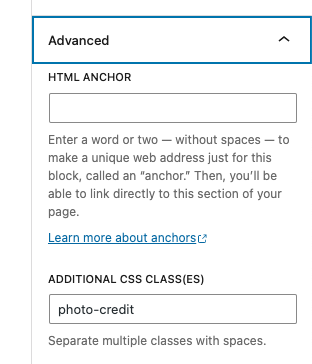
Photo Captions
Image captions or photo credits: photo-credit
Subnav
Submenu nav: subnav-links
Logos
Logos: logo-list (Add this class to the column block. Adjust the width of a logo by modifying the % width of the column.)
Arrows
PDF download arrow: arrow-pdf
PPTX download arrow: arrow-pptx
Class to hide external link arrows: hide-arrow
Images
Add dot background to images on news posts: dot-image-right and dot-image-left
For the landing intro block, you can choose left-photo or right-photo for which side the image displays.
Narrow Headings
For the narrow title header create a group block and put the heading inside and add the class narrow-title to the group.
Arrowlink
For the narrow arrowlink archive link block to go at the bottom of filter blocks, create a group block, add the arrow-link class to the p text and the link. Add arrowlink-bkg to the group. To select the bay background, use the color palette and make sure you add the color to the group block.
News Posts
For news posts, to right align an image without a caption, add the class no-caption to the photo. Make sure alignright is still selected in the block editor.
People Posts
For Our Team people bios, use the posts-row block and add the people class.
Icons
For adding icons:
Apps Buttons
- Apple icon on download button for apps posts – add apple-button to the button.
- Android icon on download button for apps posts – add android-button to the button.
- Amazon icon on download button for apps posts – add amazon-button to the button.
Exhibit H2 Icons
Example: Hummingbird icon after h2 heading on ONL exhibit page – add hummingbird class to the h2 heading.
Available icon classes:
- bacteria
- binoculars
- biotech
- blocks
- butterfly
- designquest
- electron
- flask
- forces
- glasses3d
- globe
- grass
- handlens
- hummingbird
- ingenuity
- leaf
- lightbulb
- microscope
- music
- moon
- outdoornature
- picnic
- planetarium
- snake
- sphere
- star
- store
- storytime
- sun
- telescope
- testtubes
- ticket
- theater
- turtle
- virtually
- waterfall
- youngexplorers
Camps H5 Icons
For the Opportunities for Teens and Camps & Classes pages, add the icon class name to the h5 heading. Example: add pen-paper class to the h5 “Registration open now!” text.
Recommended:
- pen-paper for “registration open now” or “application open now” messages
- calendar-clock for “registration/application closed for this year. Check back for next year!” messages
- clock for “Registration coming soon!” messages
List of available icon classes:
- pen-paper
- calendar-clock
- clock
- calendar
- info
Notification Block Icons
To change the notification icon, add the class name of the icon to the block editor Advanced -> Additional CSS Class field along side the notification class name. For example, to use the bell icon, add “bell” so it looks like this: notification bell in the block editor.
Recommended for camps:
- pen-paper icon for “register now” or “application open” messages
- calendar-clock for “Registration closed. Check back for next year.” messages
- clock for “registration coming soon” messages
- info for informational messages
- sold-out for camps/programs are sold out messages
- bell for “sign up for the notification list to be notified if there are any openings when camps sell out” messages.
List of available icons:
- bell
- pen-paper
- calendar-clock
- clock
- sold-out
- info
- ticket
- calendar
Supernova Group Component
For the supernova-group component on the homepage, if you want to use the three dots version add the three-dots class.
Padding and Margins
padding-top
padding-bottom
padding-top-half
padding-bottom-half
padding-top-quarter
padding-bottom-quarter
padding-top-zero
padding-bottom-zero
margin-top
margin-bottom
margin-top-half
margin-bottom-half
margin-top-quarter
margin-bottom-quarter
margin-top-zero
margin-bottom-zero
block-text (default block with padding and margins) – add this to a group block
Theme Color
color-background (add to landing-intro block to match the theme color for landing pages)
Hide Blocks
hide-completely
How to Add the Class Names to the Block Editor:
Click the block to select it, then add the class name in the advanced tab in the sidebar of the block editor under “Additional CSS Class(es).”